
CASE STUDY: HOIST
Company Overview: Hoist is a rapidly growing ready-to-drink hydration beverage. Their growth over the past 7 years has meant interpreting lots of retail feedback as well as marketing changes. In their most recent packaging change, they aligned with their new marketing message of ‘strong enough for the military’ due to recent military contracts.
Challenge: In 6 weeks, update full branding, colors, and convey hydration and strength with design and printing techniques.
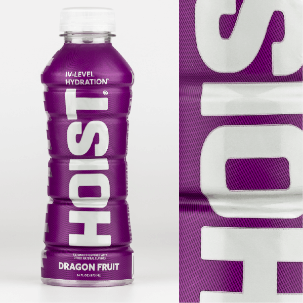
Solution: Several ink draw downs were tested to be used in the main Hoist logo – it needed to be shiny but not too much – to give the feeling of gunmetal. Additionally, a spot matte varnish was used to keep the metallic highlighted but also give the product a good feel in hand. And lastly, collaboration between their agency and Steinhauser’s pre-press department resulted in achieving very subtle fine lines overprinted on the background color.