
We understand that one missed file detail can throw off your schedule. Effective label design takes more than creativity, and small oversights can lead to production issues.
Here are some of the most common mistakes we see and how to avoid them:
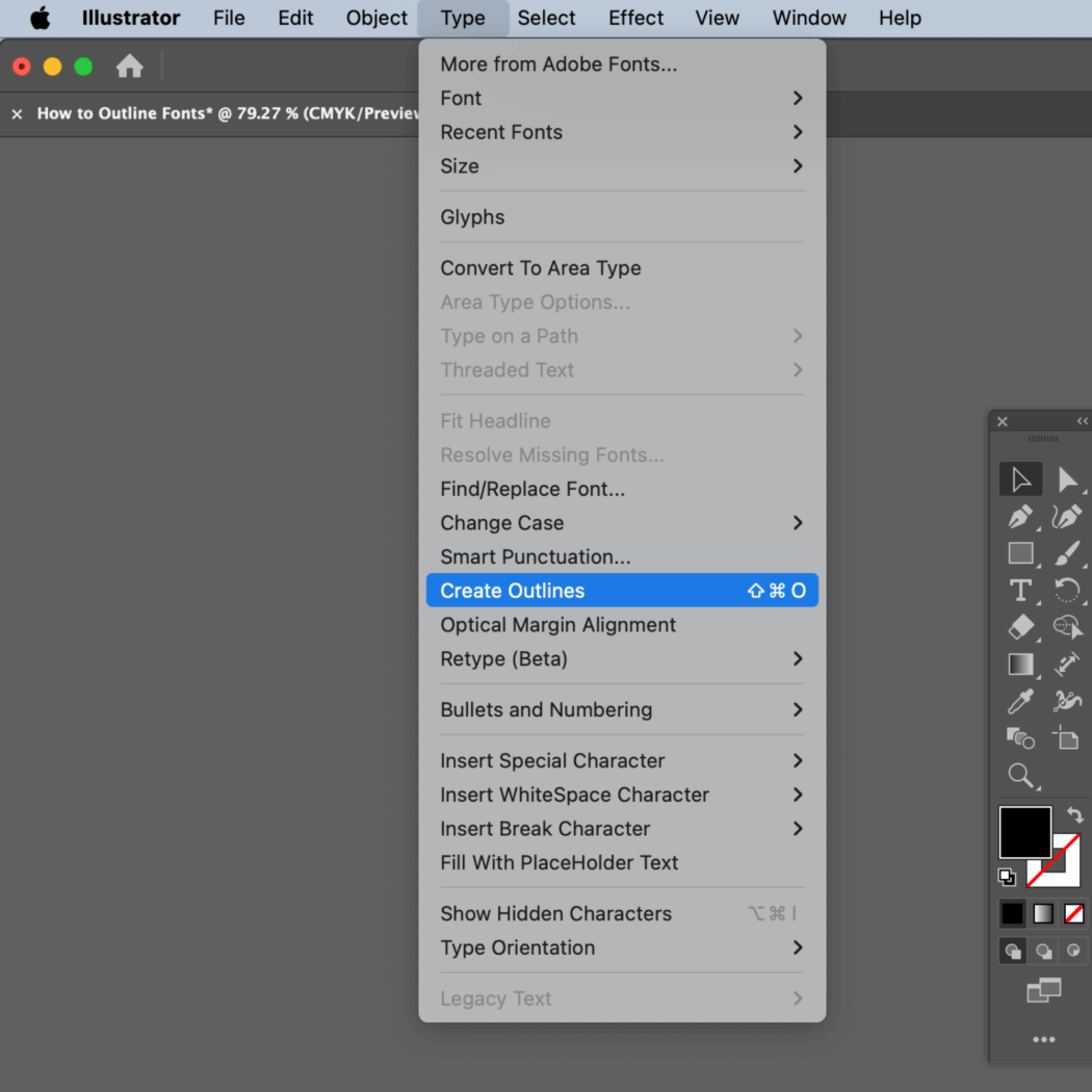
1. Fonts Not Outlined
If your fonts aren’t outlined, they may not print correctly. Outlining converts text into vector shapes, so it looks exactly how you designed it, no matter what fonts your printer has installed.
2. Inconsistent SKUs
Variations between SKUs, like layout shifts or mismatched elements, can cause confusion during production and lead to costly errors. Keep designs consistent across product lines.
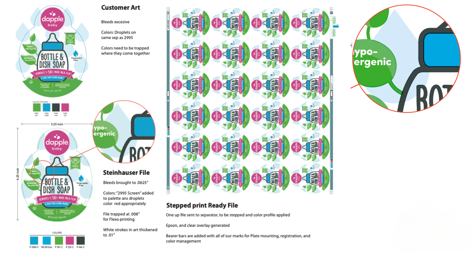
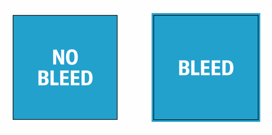
3. Missing Bleed Lines
Without bleed, even slight shifts during trimming can leave white edges on your label. Extend your design at least 1/16” beyond the die line to ensure a seamless print.
4. No White Ink Builds on Clear Labels
If you’re printing on clear or metallic material, placement of white ink is essential. A “white flood” (typically two layers) behind your artwork ensures opacity and helps prevent pricing surprises.
5. Low-Resolution Images
Blurry or pixelated labels are often the result of low-resolution artwork. Make sure all files are created at 300 DPI for sharp, high-quality results.
6. Missing Support Files
Linked or embedded images should always be included when you send your artwork. These files should also be 300 DPI to maintain print quality.
Designing labels for print doesn’t have to be overwhelming.
At Steinhauser, we’re your partner from the very beginning — not just printing your files but working with you to make sure your label design is truly press-ready. We provide clear guidelines and catch potential issues before production starts, so your design looks exactly how you envisioned. Need additional support? That’s what we’re here for.
Found this useful? Join our monthly newsletter for practical tips, updates, and a behind-the-scenes look at Steinhauser. No spam, ever.